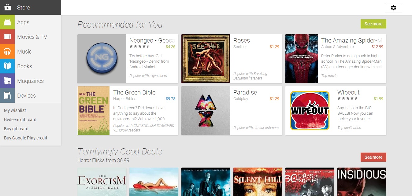
We got a look at the Google Play web store redesign in early June via some leaked images, having heard at Google I/O that the Play Store would soon be given a major design change to make it resemble what we see on Android devices. That changed redesign has taken place and is now live on the web for everyone to check out.
This follows the Google Play store version 4.0 for Android redesign we saw back in April, with Google making it available on the same day they confirmed leaks that had surfaced regarding it. As for the new web redesign, the Google Now card style is present and looking more refined than ever.
Everything you’re used to in the Play Store is still present, but things have been shuffled around and tweaked a bit, becoming more uniform with the Android design overall and what device users are used to seeing. Things are easier to pull up and navigate through, and the entire design comes across as cleaner.
Some things you will notice include larger screenshot previews for apps you’re checking out, which is convenient. There’s not much else to say on it, except that it is nice to see the design go live and to fall in line with the Play Store we see on our devices. What do you say? Is the design a keeper? Let us know!
SOURCE: Google Play


The design looks clean and tidy. But it is kind of confusing when it comes to finding my apps section. When I click my apps I see the applications what all I installed and uninstalled in my mobile rather what I presently have it installed in my mobile. To find what I have presently I need to go to settings and my order which is kind of too much to do for a new and regular users.
and How to uninstall from google web store.
The only reason I ever access the store from a computer browser is to install and uninstall apps remotely. I can’t find where to do either. Used to work so smoothly.
Layout looks great, but i can’t see what apps I currently have installed. And it’s telling me i have old apps installed when they are not.
yeh … i really cannot find the apps currently installed on my device … so frustrating …
Did they remove the reviews filter? I used to be able to filter only those comments with the same device as mine.