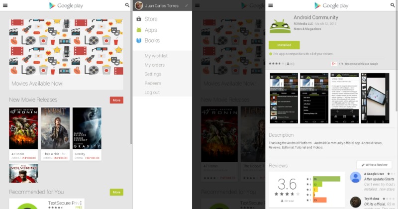
As one sequel to a wildly popular game says, “it’s about time”. Google has now rolled out a new look for its Google Play Store when viewed from a mobile web browser, taking it a bit closer to the actual mobile app experience.
It is really mostly a visual change, but even such seemingly inessential user interface tweaks can make or break the user experience. Previously, when one browsed Google Play Store in a web browser on a mobile device, one will be presented with the regular, desktop version, which doesn’t exactly lend itself well to browsing on a smaller screen. Now, however, you can navigate through the web portal of Google’s store pretty much the same way you would on the mobile app.
The main menu has been neatly tucked away in a side navigation panel, which can be summoned with the “hamburger” (three horizontal bars) icon at the top left. The search box has also been hidden and can be shown by tapping on the search icon at the top right. In short, everything almost works as if you were browsing the store via the mobile app. Except for some minor stylistic variations, the differences between the two shouldn’t be that noticeable.
This mobile revamp of the interface has some uses, despite already having a better mobile app. For one, some website link to Play Store apps that don’t exactly open in the Google Play Store app itself. At least now, users will be able to navigate through the website without having to switch their mindsets from mobile to browser. Some devices might not also have a Google Play Store app and thus perusing Google’s selection on a web browser would have been a chore without this redesign. And finally, it simply delivers an overall more responsive web design that automatically adjusts to the best possible mode depending on your browser or device, which, in our opinion, is always a good thing.
SOURCE: Google Play Store


