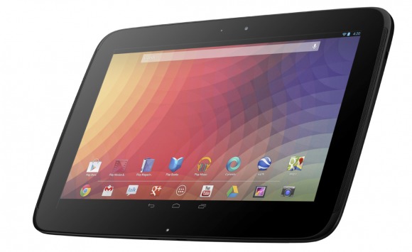
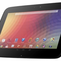
Google may have been forced to cancel its Android event in New York City today due to the threat of hurricane Sandy, but that isn’t stopping it from making announcements anyway. Google has officially revealed the Samsung-made Nexus 10 tablet, and it seems like most of the rumors and leaks were indeed true. For starters, Google has confirmed that the Nexus 10 will be running Android 4.2 out of the box, so get excited.
It will also come equipped with that long-rumored 10-inch WQXGA display running at an impressive 2560 x 1600 resolution. On the inside, we’ll have a A15 dual-core processor clocked at 1.7GHz and working alongside 2GB of RAM, so expect the Nexus 10 to be a speedy little tablet. The Nexus 10 also makes use of a beefy 9,000mAh lithium-ion battery, which Google says can provide 9 hours of video playback and a whopping 500 hours of standby time.
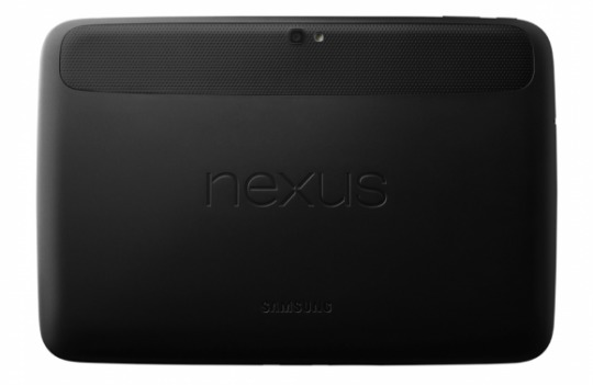
The Nexus 10 will come in a couple different variants – one with 16GB of internal memory and the other with 32GB. Both will be Wi-Fi only, and both are equipped with a 5-megapixel rear-facing camera, which Google says can record video in 1080p at 30fps. There will also be a 1.9-megapixel front-facing camera to use for video chatting, and all of this is packed into one slim and lightweight package – the Nexus 10 has a thickness of just 8.9mm and weighs 603 grams.
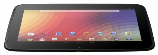
The 16GB Nexus 10 will set you back $399, while the 32GB costs $499. Both will be available on Google Play Stores in the US, UK, Australia, France, Spain, Germany, Canada, and Japan starting on November 13 – just over two weeks from today. Keep it tuned to Android Community, because we’ll have more information of Google’s new Nexus line coming up shortly.


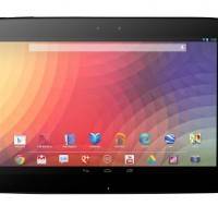
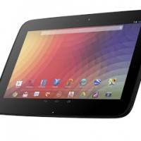
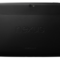


The back looks super sexy now 🙂
True, it looks great! If I had the choice, I would have preferred the Nexus 7 style back (all one texture with no breaks), but its so small a matter that it isn’t worth thinking about.. The 10 looks fantastic, it should perform fantastic, and is a fantastic value at $399… Fantastic! :p
Does it have an SD or Micro SD slot? That’s the million dollar question.
lol, just get Galaxy Note 10.1 then, it also has Wacom tech besides the microSD slot
But then your stuck with that awful TouchWiz, and a chance in hell of an update.
what’s so awful about TouchWiz?
Reminds me of windows, its so bloated and heavy with tweaks. Sometimes more is less. Plus those icons have iOS written all over them, no thanks.
well I don’t know about the past but I’m using Samsung’s latest tablet Note 10.1 and the core UI doesn’t seem bloated or laggy to me, also the widgets can be removed for cleaner look.
I guess its a matter of perspective, Ill take the clean pure Android UI any day. Android has come a long way, and Jelly bean really shows what Android can do and look like. In my view there is no room for embellishment, Jelly bean holds its own.
I’m glad the pewter colored back is gone….this looks WAY better
Also, the “giant” bezel people have been complaining about (irritatingly) is simply the black information bar and home buttons at the top and bottom of the screen respectively.
Honestly, the horizontal bezels look very narrow.
Sheesh, Android tablets have come a LONG way in a short time.
He mentioned Japan too 🙂
tun tun tun!
tun tun tun!