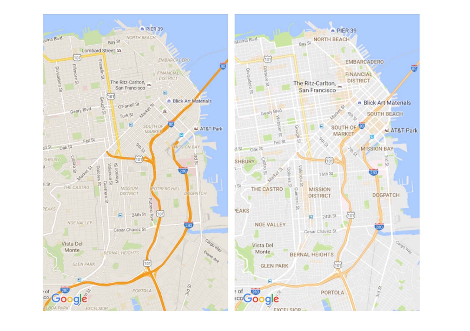
Have you ever looked at your Google Maps and be all confused because of all the lines and grids and things that you don’t really need to know? Well it looks like Google has heard you as the latest update to the desktop and mobile version brings you a much cleaner look, which also gives you a better way of looking for things to do in that area especially if you’re just visiting that place or have recently moved there.
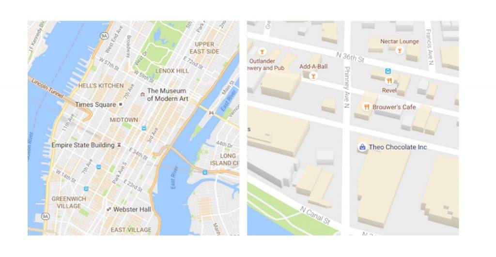
First off, the maps look a bit different and much cleaner because they’ve removed unnecessary elements like road outlines, giving way to the more important information like traffic and transit. Even the typography for the street names, transit stations, business establishments, etc, has improved so it’s now easier (and more pleasant) to read. If you’re not familiar with the area, it’s now much easier for you to navigate the less cluttered interface.

Another new feature in the update is the orange area on your map which will represent the “areas of interest” in that place. This means that area is full of activities and establishments that you can visit. When you’re planning to go to a certain city or locale, just search for it and when you see the orange area, zoom in to see the details for the various establishments and tap on each one to see more information and maybe even photos if some mappers have uploaded. These areas are determined through an algorithmic process but in high-density areas, they also use a “human touch”.
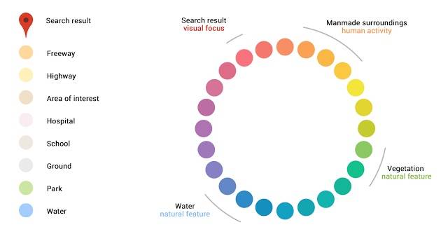
Google Maps also now has a more subtle color scheme so you can easily differentiate various places like hospitals, schools, man-made structures, natural features, etc. Update your app though its Google Play page and enjoy this new look and new features when you’re navigating through various places.

SOURCE: Google Maps


So I was looking for the local supermarket Sunday opening times, google maps came up on the supermarket site, I thought they’d broken something, the roads were almost invisible. Scratches head, goes directly to Google Maps on Firefox, same thing, WTF? Opens Chrome, it’ll should right there, same thing FML.
Anemic, white roads on an off-white background, this will be impossible to use on my phone, hell it’s not even usable on the PC in the dark. I checked my monitor and desktop video settings.
And then the comments that say it’s good. F**K MY LIFE it’s total sh1t and people are praising it, ‘the emporers new clothes’ line has never been more appropriate. A map without roads and the UX designers think this is a good idea, has the whole world just lost 90 IQ f**king points???????
I thought I’d lost my mind. I can’t use Google maps as the roads are effectively the same colour as the background. How does this stupidity get past testing? The world is indeed a strange place. I’m off to a different map site. Any recommendations?