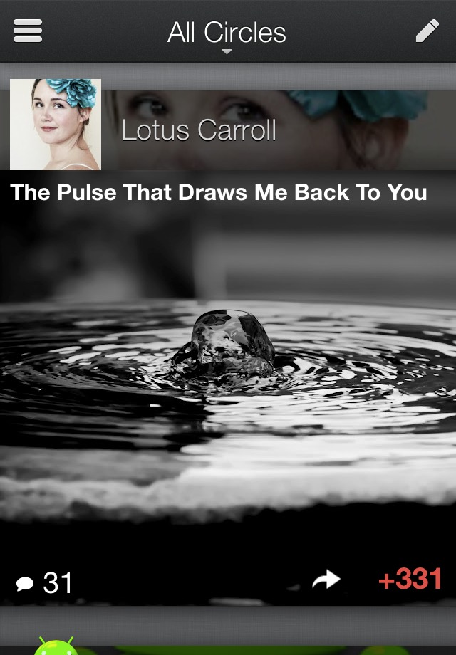
The Google+ app for Android is a pretty solid little piece of software, but that doesn’t mean that it can’t be improved upon. And according to Google’s official blog in the UK, that’s just what they intend to do. The screenshots posted show a truly massive visual update, which is strangely hitting the iOS version first, with the Android updated slated for sometime in the next few weeks.
The entire app is much more focused on photos than it was before, removing much of the sterile white space and highlighting the visual element whenever possible. Even the color scheme has changed: it’ll take on a darker tone that more closely resembles Ice Cream Sandwich’s overall visual UI. Keep in mind that the fonts and icons shown in the screenshots may be modified when the Android app gets the update.
Disappointingly, there’s still no word on an Android tablet app for Google+. Sure, you can use the app on tablets, but it just blows the interface up – we’ve been hoping for something a little more solid for Google’s own social network for months. Then again, the blog post teases “a few extra surprises” for when Android gets the update in question. Cross your fingers, folks.


