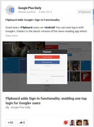
Google+ has an incoming update which should make it a bit more appealing. The change affects links, bringing in larger thumbnails and bold text. It also puts Google+ closer to their peer social networks, aesthetically, which could win some users of those platforms over.
The update will make links with thumbnail images larger, and give the title text associated with it a bolder font. By going bigger on both fronts, Google+ is taking a hint from Facebook, where large images and bold text under win the day. The update gives Google+ a less utilitarian look, which has been pointed to by some as a reason they don’t use the service.
The move also pits Google+ against Twitter in the design arena, who recently redesigned their own interface. In that instance, the move by Twitter was seen as more Google+ in design. An odd dance, but both redesigned links to be more visually appealing. In Twitter’s case, the update is only available to a select few news sites. The Google+ change is for anyone posting a link.
The update is rolling out now for desktop, but we’d expect it to come to mobile at some point soon as well. Google is pretty good about having Google+ look very similar on mobile and desktop, so this should hit your smartphone and tablet soon. If you’re not seeing the change on your desktop, don’t fret — like all Google updates, it’s rolling out incrementally.
Source: Google+ Daily


Super. I’m hoping when they update their mobile app, they’ll re-add the list of my circles in the Location tab whom I can see their location. It was removed in the last update, and I can only see myself.