


Yahoo has finally taken out its launcher from invite-only beta. But aside from also giving it a new name, now called Yahoo Aviate, the former search giant has revamped the launcher’s design, which could leave some revisiting users a bit confused.
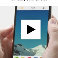
The entire philosophy behind Aviate is to simply your home screen. It tries to do so by banishing the clutter-inviting conventions of regular homescreens and providing users with a clean, organized slate. It even practically removes the separation between homescreen and app launcher/grid, by putting the latter just a simple swipe away, making it feel like it were just a dedicated panel or page. But Yahoo Aviate also wants to make your homescreen smarter, by injecting a bit of user habit learning and contextual information to the mix.
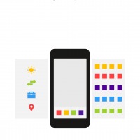
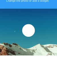
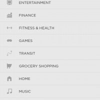
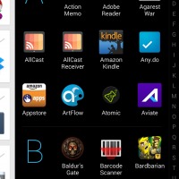
Aviate has accomplished those two goals even before this public launch, but now it rearranged things a bit. The concepts of Spaces and Collections are still there, only they’ve been relocated to new places. The main home screen has been left alone to be just that, your main screen. It is a place for your favorite photo or photos, not a wallpaper, some quick launch icons, and your choice of widgets. Remember though that the same height limitation, basically only one screen worth, for widgets on the home screen still apply. Collections, the automatically grouped apps, are still located on the right and still don’t let you create your own groups.

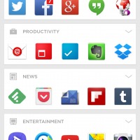
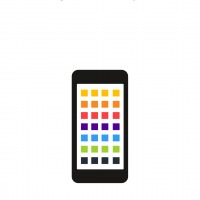
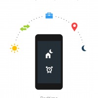
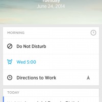
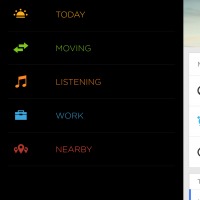
The dynamically-changing Spaces, however, have been moved to the left of the main screen, right beside the Spaces settings panel, bringing the total number of screens to a more balanced number of five. It is still the same vertically scrolling list of widgets and gadgets, though it feels that the number of custom Aviate widgets you can use have been reduced a bit. You can still add Collections and the usual Android widgets of course. The Apps list hasn’t been moved but did get a face lift. To make it look and feel like a distinct section of the homescreen, it sports an inverse color scheme, with a light on dark theme instead of the default dark on light for the rest of the homescreen. Comically, that convention actually only works if you use the Light color scheme. Switch to the Dark one and the Apps list stays dark.

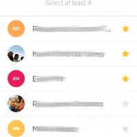
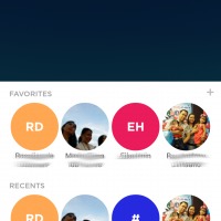
Yahoo Aviate did get one new feature for this release in the form a new Favorites people section. A simple swipe from the bottom will reveal a panel containing circles for your favorite contacts. From there you will see both Favorites and Recent people, and get to choose to launch the Phone or Messaging app directly.
Yahoo Aviate is now live on Google Play Store and free for the taking, with no in-app purchases needed. It will be interesting to see what Yahoo still has planned for this admittedly unique smart launcher, and whether Yahoo will be riddling it with ads in the future to make a profit from it.
SOURCE: Yahoo


Do like Aviate, but get annoyed by not being able to hide status bar. Clutters the screen. Any tips? (don’t want to root).