


After previous leaks, today Google went ahead and announced and released the all-new Google Play Store version 4. This morning they confirmed the new Play Store was real and coming soon, and stated it would be rolling out in the coming days and weeks. Obviously we’ve already posted the download files, but below you’ll get a hands-on look at what is new, how it looks on a tablet, and a comparison with the old version.
We decided a quick hands-on video showing off the awesome new design, the new features, how it looks on tablets and more was in order. So if you haven’t downloaded and updated yet, here’s how it looks and what it’s all about. Aside from the obvious, the user interface is extremely different and much cleaner. We’re huge fans of the card style layout here.
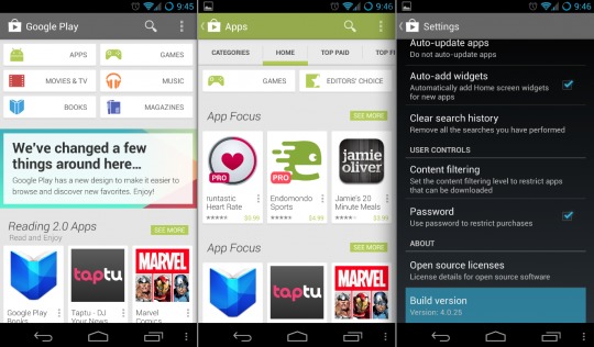
Google Now introduced the current card style design we currently are loving with the new Play Store, and the same goes for the new mini-menus. The three little dots are actionable and are extremely helpful. First off the entire user interface is very clean, sleek, and simple. Everything’s a bit more uniform if you ask us, and beautifully laid out with larger HD images. The suggestions tab is great too. You should all check that out. Instead of explaining it all, take a peek at our hands-on below.
The new card style layout and menus are extremely helpful as we showed in the video. If you want to download an app, song, or game you no longer have to leave the list of apps to install it. I hated always losing my spot while searching through the store. While the 3 little dots can be hard to hit at times, tap them and you can instantly install an app without leaving your place, or even open an app right from the Play Store.
I’m also enjoying the fact that we don’t have the little checkbox for auto-update anymore. Instead that is in settings rather than on every single download page. We’re a bit curious how Google plans to implement the auto-add widgets option, especially for multiple sized widgets, but we’ll be testing that out soon.
Obviously there’s no new content but it’s the delivery, look, and feel that’s all-new and severely improved here. Again get the latest Google Play Store that was released earlier today right now by clicking here! What do you guys think of the new Store and design?


Cory, you clearly missed this over the past 10 Market/Play Store updates:
“We’re a bit curious how Google plans to implement the auto-add widgets option”
1. Google Play/ Android Market have always used the term ‘auto-add widgets’ to add shortcuts to the apps. The bloody monkeys at Google have been calling shortcuts as ‘widgets’ since the inception and it’s annoying. If shortcuts were widget, they should have been present in the “Widgets” section of the app drawer.
2. Let’e be a little more ballsy in the review and blast Google for STILL failing to address filters for representing All Apps and Installed Apps pages. In it’s current state, the list of “All Apps”, it’s practically useless if you’re gone through over 50 apps. They should pre-load and cache the entire list instead of waiting for a user scroll before loading. The Al; Apps section should also let you multi-select apps and install them in succession.
You have to leave something for Google Play 5.0
Trust me, Google still won’t get it. It took them two iterations to perfect the notification shortcut toggles (long-press enable/disable as opposed to jumping to a menu) in spite of several solutions in their faces for nearly 2 years. Even now it’s a rather poor implementation.
Oh you’re right. I know it auto adds the widget “aka shortcut icon” to the homescreen if you’d like. I could of sworn this was in addition to that, but now I see it was not.
And yes, We’d love to have filters for all apps, installed apps, and even purchased apps. I’m actually pretty sad we STILL don’t have that. Bad call Google
As a reader however, I am expecting ‘you’ to be the voice in visibly calling out Google on their lapses in the hopes that someone from the Android team that reads your blog realizes where the team screwed up and gets it on the agenda to fix it.
I would not put it in this article, but rather a post by itself because I don’t expect an Android team member to dig through a ‘post discovering the new Play Store’ when they’ve been playing with it for weeks. But a new post titled say, ‘The New Play Store Still falls woefully short of some basic features”.. da..da..da…etc. My 2c for YOU to get noticed.
Thanks for the reply.. Maybe I’ll write up a column on it, because I do agree.
Thanks for reading. We love to hear opinions
Thanks – someone with a voice needs to rip the Android/Google team apart for making so many basic oversights that are sometimes downright asinine.
My advice would be to host a VERY VISIBLE feedback session on Android from your readers before you compile a kick-ass column that does some real kicking. This would be a way for Sunder to possibly have a finger on user sentiment as he starts in his new role.
I think your column would make more sense after I/O after we see what Google has been up to over the past year and what we want to see as users over the next year.
I love this new interface.. so clean.. and simple.. goes well with the look and feel of 4.2.2 on my Nexus 4!!